Courtesy of Mark Coles
“Look at this glorious graph!” is a phrase seldom exclaimed across boundaries of disciplines and interests. Especially when it comes to those that have many lines, tiny labels, and near-incomprehensible labels.
And yet somehow, these often uninspiring and sometimes criminally uninformative visuals live in the same world where artist Stefanie Posavec designs her data projects. Ms Posavec guided us through her approach to data through a range of absolutely fantastic projects where data met science and exciting things happened.
It’s quite refreshing to think of data functioning as creative material and a way of responding to subjects. A visceral and deeply embodied approach to data demonstrate that physicality and experience can be an extremely effective method of communication. How many of us in the scientific community have thought of dance and jewellery as data visuals? The Relationship Dance Step as part of a Facebook Art Residency, turned digital interaction data between couples into a series of dance steps, and Air Transformed developed deceptively decorative necklaces from Sheffield’s air quality data.
Such examples raise questions on the purposes of data collection, visualization, and public engagement. What is it that data and their visualizations are created for? Ms Posavec invited us to consider data as a souvenir of experience and a way of finding resonance with other people. The Dear Data project, a cross-oceanic labour of love and art shared with artist Giorgia Lupi over sharing personal information through painstakingly detailed and emotive illustrations of life. A process then further complicated by committing these artworks to postcards and sent through regular mail.

Courtesy of Mark Coles
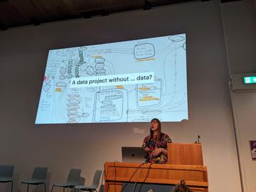
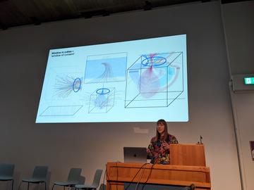
But how does one document with data in the absence of it? And here we were presented with Data Murmurations: Points in flight, a data project with work through the Airwave Health Monitoring Study, where the data from the biobank could not be used. It doesn’t seem to matter – here still is data about data - the human experience of participants and the process of data itself; system maps with intricate lines following complex journeys through cubed spaces, windows of consent, and clouds of data points. One thinks that stakeholders must prefer being represented as part of detailed works of art and not only as numbers on spreadsheets.
When does data transform into diagram versus an artwork? When does data function as a conversation starter? (A conversation starter that is more than ‘and what’s all this then?’). Enter Updating Happiness. With the Wellcome Collection, the artwork functions as an emotional check-in and self-reflection exercise. Perhaps also a reaction to the banal and often strange inspirational quotes that make the rounds on social media with pastel backgrounds and uplifting language that does the opposite.
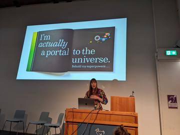
‘I am a book. I am a portal to the universe’, is a welcome addition to this author’s bookshelves and provides an intriguing data device where everything is at 1:1 scale, invites the participation of all one’s senses, and is very likely, a portal to the universe. This is a book that is literally, incredibly physical and pushes the boundaries on public engagement and data working to inform. This leads us straight to Rebecca Berens with an innovative use of digital shopping platforms to inform the public about difficult topics in synthetic biology. Shopping stores and advertisements inviting one to purchase moss as living wallpaper and carpets and modular human body parts while thinking about multi-tasking while asleep.
As the participants (struggled with) assembling paper brain hats and drawing data selfies, discussions turned towards the importance of showing the labour and efforts of data collection and adopting an artisanal and experiential approach to developing visualizations. What is it about data that is important and to whom and what is it that we truly mean to communicate? What changes when we think of data as an in-between material instead of an end in itself?

Courtesy of Mark Coles
Saher Hasnain is a Research Fellow at Reuben College, within the Environmental Change theme. She is a researcher at the Food Systems Transformation Programme with the University of Oxford's Environmental Change Institute.